| < Day 1, Part 2 | Return to homepage | Day 2, Part 2 > |
Day 2, Part 1
Welcome to Day 2, Part 1! This part will go over data cleaning, chart types, how to find datasets, and other aspects of getting start with creating a data visualization.
Structured, semi-structured, and unstructured data
Data comes in many formats – sometimes computer generated, sometimes handwritten in a log, often collected by phones, and even found on the back of a napkin. However, most data, regardless of where it appears, is either in a structured format or unstructured format.
Structured data
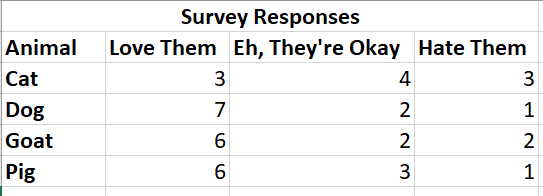
Structured data is typically tabular and consists of columns and rows in a database or a spreadsheet. When cleaned, all of the rows will have the same columns – in other words, there are no row headers, only column headers. Most data visualization tools that can create visualizations with quantitative data require the data to be structured for them to work properly. This includes tools such as Tableau and Excel.
In the example below, take note how each data point is organized into columns and rows.
Semi-structured data
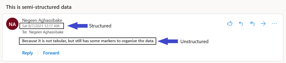
Semi-structured data is not tabular, but it does contain some tags or other ways of organizing the data. An example of semi-structured data is an email, which contains some markers to identify parts of the data (for example, sender name, date sent, size of attachments, and so on) but also includes parts that are not tagged (such as the subject or body of the email).
Unstructured data
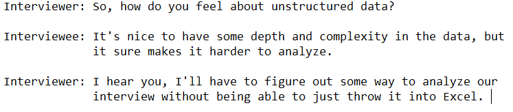
Unstructured data does not organize information in a particular model or hierarchy. Some examples include audio, video, and the text from an interview. While this format is harder to analyze using some data visualization tools, it can provide a level of complexity that can be stripped out when data is structured.
Data cleaning
Data cleaning (also called data wrangling, tidying, normalizing, etc.) is the process of finding and correcting inaccurate or unstandardized data points. With many data visualization projects, data cleaning is the bulk of the work.
Cross-tab vs normalized data
Part of data cleaning may involve making sure that the data is in a structured format that can be analyzed by a certain tool. This may involve converting a cross-tab dataset into a normalized dataset.
Look at the example below of a cross-tab dataset. In order to find one record, the reader has to take two steps: go down to a specific row, then go to a specific column (or vice versa). Another way to look at it is that there are both column headers and row headers.
This format is difficult for many data visualization tools to process. Most popular tools require that each record be its own row (in a normalized or “unpivoted” format). The same example of structured data from above demonstrates this format.
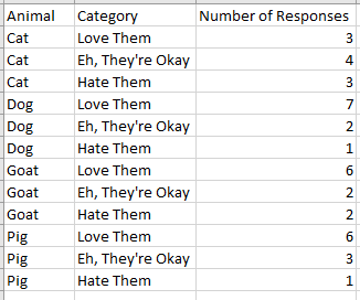
Note that for any particular record, there is only one step to find it: find the record.
It can take some work to convert a dataset from cross-tab, but before you put in too many hours, check out these instructions on how to automatically normalize your data using the Microsoft Excel Pivot Table Wizard
Standardizing
When we read “100 Ave,” “100 Ave.,” “100 Avenue,” and “One Hundred Ave,” we understand that these records are likely referring to the same record. However, a computer will process each of those as separate locations, leading to an unclear visualization.
It’s often easier to set standards when collecting data in the first place rather than having to retroactively clean the data. For example:
- How will phone numbers appear? (xxx) xxx-xxxx OR xxx-xxx-xxxx OR xxxxxxxxxx
- How will street names be collected? Street OR St. OR St OR ST OR st
- Will latitude and longitude be automatically stored in separate columns, or will you have to manually separate them?
If you do have to clean the data or are using data that you did not collect yourself, you can try to make it easier on yourself by using Excel’s find and replace function.
Cleaning
When preparing your data, clean out any stray punctuation, spaces, test records, spelling errors, and any other issues that impact the data. For example:
- JAMA : → change to JAMA
- Zygon. → change to Zygon
- Zootopia / → change to Zootopia
- Zootaxa.,Zootaxa., → change to Zootaxa
- (if using title case) Zoological journal of the Linnean Society → change to Zoological Journal of the Linnean Society
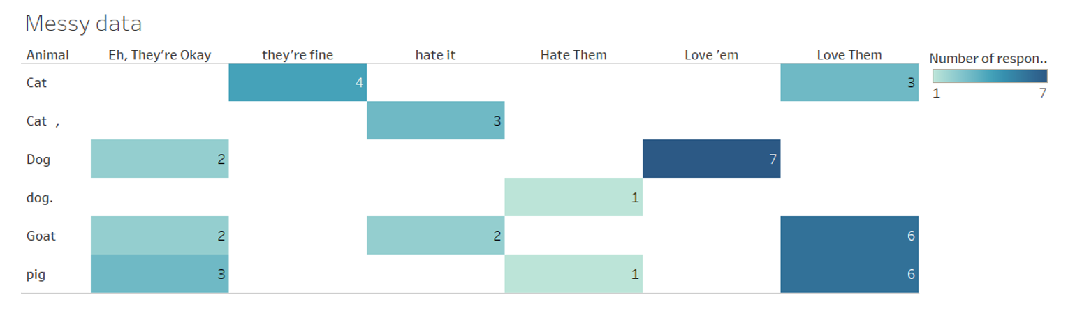
Below is an example of messy data prior to cleaning. Note that there are inconsistencies between the categories that make it hard to fully understand the data.
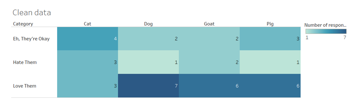
In the next example, the data has been cleaned and each of the categories are easier to compare against one another.
While you may not use all of these tips, watch TrumpExcel’s “10 Super Neat Ways to Clean Data in Excel” by clicking on the image below to pick up some strategies to save time when cleaning data.
List of data preparation tools
There are many tools, some proprietary and some open source, that can help with the data cleaning process. While this week will not go into these tools in depth, feel free to learn more about them using the resources listed below. (The ones listed below do not require any programming skills.)
- Excel: proprietary but access provided through the UW, “Top ten ways to clean your data”
- OpenRefine: open source, user manual
- Tableau Prep: proprietary, specific to Tableau, “About Tableau Prep”
File formats
The file format that your data is in depends on the data itself and how the data was collected. Some popular file formats include:
- Quantitative data: Comma-separated values (CSV, .csv), Excel (.xlsx), example: counting salmon populations in the PNW
- Qualitative data: Plain text file (.txt), example: interviews with health care providers during COVID-19
- Geospatial: shape files (.shp) and Geographic JavaScript Object Notation (.json, .geojson), example: school district lines
While there are many more file formats, the ones above are the ones you will likely come across most frequently when starting out.
Finding data
There are many ways to find data, although the perfect dataset might not exist. Some data is easier to find than other – for example, while county health statistics can be found without much difficulty, proprietary data (such as company data) can be harder to find or completely inaccessible. Below are some areas to start looking for data. While these can be a great starting point, this is not a comprehensive list, so continue exploring!
- Data Planet: The UW provides access to Data Planet, which can be a good place to browse datasets and start to create charts and maps.
- Washington State Data: This guide walks through different Washington state departments and where to find the data they collect.
- Geospatial Data Resources: This guide includes links to local governmental spatial data that is available to the public.
- Civic data: Open data related to city, county, state, and federal operations are often available through open data portals.
Day 2 readings
- University of Virginia Library, “Data Types & File Formats”
- University of Washington Libraries, “Find Data”
- Michigan State University Libraries, How to Cite Data
Whenever you’re ready, proceed to Day 2, Part 2 in order to be introduced to the data visualization tool for this week and instructions on how to create your own data visualization. You can also return to the homepage