| < Day 3, Part 2 | Return to homepage | Day 4, Part 2 > |
Day 4, Part 1
Welcome to Day 4! Today will cover accessibility and data visualization. Many thanks to Reed Witherspoon, University of Washington Libraries Open Scholarship Commons Graduate Assistant, who co-created and co-taught the original version of the content below.
Accessibility
While equity, diversity, and inclusion have become increasingly more common in discussions about data visualization, accessibility is another critical element that deserves to be addressed as well. Accessibility sits at the foundation of inclusive data visualization design and is not an option or feature that can be turned on or off. While there are no formal around creating accessible data visualizations in the same way that there are for general web design, it can be helpful to make progress, even if not perfect.
One of the guiding principles of this work is universal design – designing for everyone regardless of disability. The comic below depicts a person in a wheelchair who says, “Could you please shovel the ramp?” A person shoveling some stairs responds, “All these other kids are waiting to use the stairs. When I get through shoveling them off, then I will clear the ramp for you.” The person in the wheelchair responds, “But if you shovel the ramp, we can all get in!”

This comic demonstrates how universal design is beneficial for all. This approach to data visualization can help make visualizations more accessible for all.
Standards
There are federal requirements for web accessible materials. You may be familiar with Section 508, which outlines accessibility requirements. There are also additional state-specific standards. The University of Washington has their own policy requirements as well. For more background information, check out the Accessibility Self-Paced Training in Canvas by Ana Thompson (Learning & Access Designer, Office of Digital Learning & Innovation, UW Bothell).
Design choices
There are specific design choices that can make visualizations more or less accessible. The next section will go through some of these choices.
Color
Whenever possible, don’t use color as the only medium to communicate information. People perceive colors differently. Instead, try using a combination of color, text, and shapes to label information.
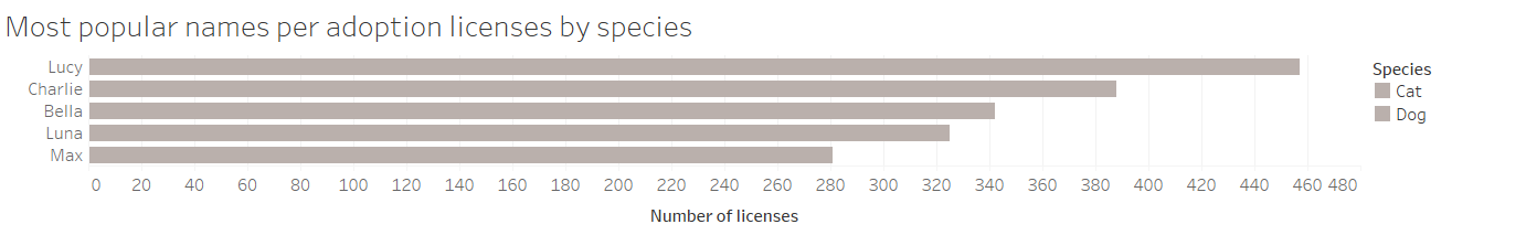
When you use only color to distinguish between variables, such as in the example below…
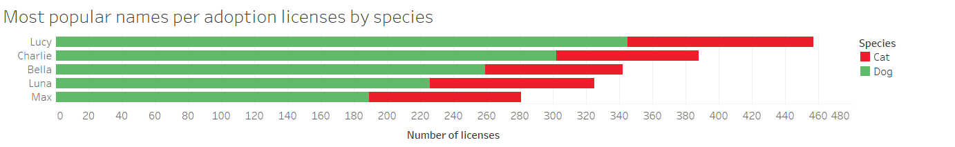
…your chart might look like this to some readers.
In addition, some data visualization software doesn’t design for better options due to so-called “best practices.”
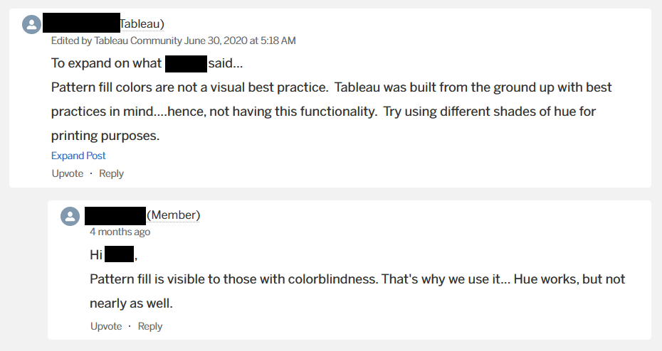
This screenshot of a conversation on a Tableau forum shows where some tools might prioritize aesthetics over function and accessibility. In the thread, the Tableau representative says, in a longer thread asking about pattern fills, that “Pattern fill colors are not a visual best practice. Tableau was built from the ground up with best practices in mind…hence, not having this functionality. Try using different shades of hue for printing purposes.” A Tableau user responds with, “Pattern fill is visible to those with colorblindness. That’s why we use it…hue works, but not nearly as well.”
This conversation demonstrates the tension here between some industry-defined best practices and accessibility best practices.
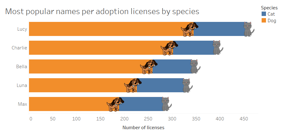
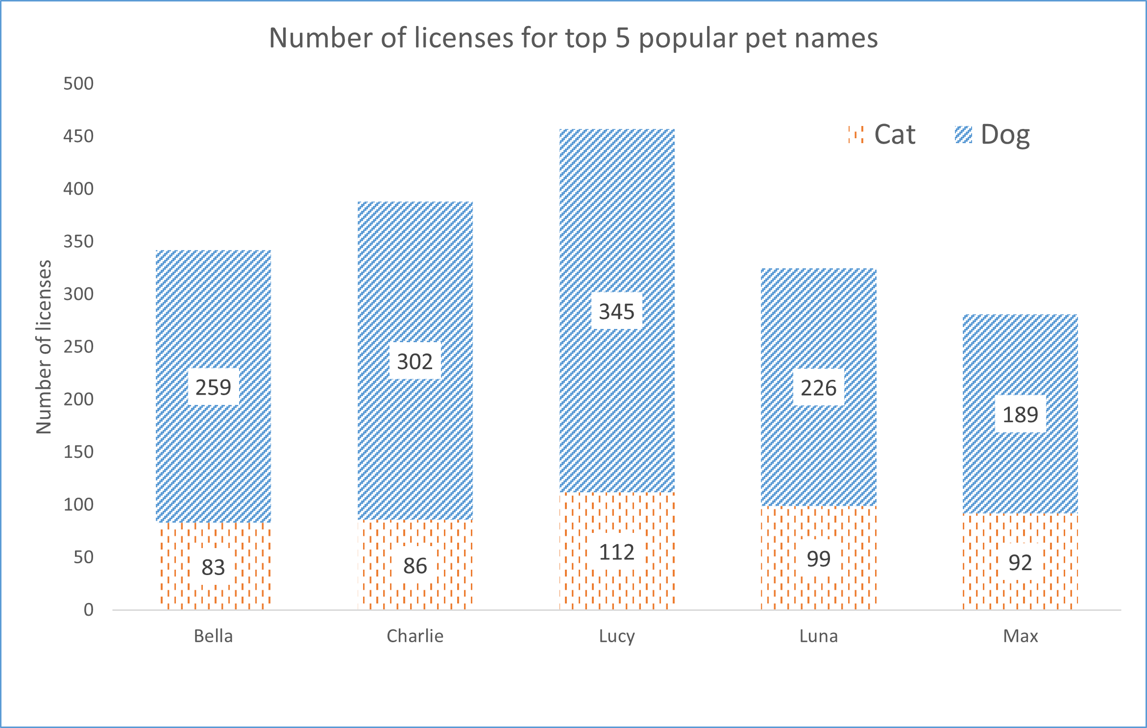
One way around this issue is using icons to note length. In the visualization below of the five most popular names of pet licenses in Seattle, you can see a dog icon that ends where the bar for dog ends and a cat icon where the bar for cat ends. Given the data, it might even make more sense to separate the animals or do a side by side, both alternatives that may be more accessible.
If the tool you are using allows for a pattern fill, that is another way to distinguish between variables using an element other than color, as seen in the chart below.
Layout
When setting up the layout of your visualization, avoid dense and complex arrangements. Try to develop clear and logical layouts – simple layouts can communicate the information you need without being overwhelming for readers.
If you know you will have readers engaging with your visualization from more than one type of device, consider how a resized version of your visualization will look on those devices. This is particularly important for mobile users who may try to read your visualization in both landscape and portrait mode.
Language
Avoid paragraphs and complex sentences that would make it difficult for a reader to understand the content. Short and clear sentences, along with subheadings and bullet points, can be just as effective in communicating information.
Font and contrast
If possible, avoid highly stylized fonts and instead use sans-serif fonts. Make sure that there is a high enough contrast ratio between the font and the background.
A helpful tool to check contrast is the WebAIM contrast checker, which is available for free.
Labels and titles
Use labels and titles to help readers, particularly those using screen readers, to understand the information in your visualization.
Alternative text
Alternative text (“alt” text) is text that can be read by a screen reader when encountering an image. Alt text should be descriptive of the main points of the visualization – not just what it looks like, but important points. Keep in mind that most screen readers will only read out about 100-150 characters, so keep your alt text limited to 1-2 sentences.
Each tool has its own method to add alt text, but most major tools will include that functionality.
Interactive elements
Check to see that interactive elements, if you have any, can be done using only a keyboard. If you use features that are only visible when hovering over the visualization, be sure that the information there is also viewable on the visualization itself so that it is not cut off from those using screen readers. Label any interactive elements.
Setting up for accessibility
It is much easier to build in accessibility at the start of creating a visualization rather than having to retroactively embed accessible functions. As you’re designing your visualization, plan for the pieces that you can make more accessible.
While there is a long road for accessibility in the field of data visualization, any step in that direction is helpful and makes sure all readers can access information rather than only a select group of people. Keep seeking out resources – designing for accessibility is an ongoing process and there isn’t a one size fits all solution.
Accessibility practice
Use the accessibility practice Excel workbook to test out the design choices above. The “practiceviz” tab has the original, not very accessible version, and the “moreaccessibleversion” is the visualization after some of these choices have been implemented.
Note that Microsoft Excel is available to all UW students, faculty, and staff. For more information on how to download Excel using an institutional license, refer to the IT Connect Microsoft Software.
Day 4 readings
- Doug Shepers, “Why Accessibility Is at the Heart of Data Visualization,” Nightingale: The Journal of the Data Visualization Society, May 21, 2020
- Sarah L. Fossheim, “An intro to designing accessible data visualizations,” January 12, 2020
- Chartability
Whenever you’re ready, proceed to Day 4, Part 2 or return to the homepage.