| < Day 3, Part 1 | Return to homepage | Day 4, Part 1 > |
Day 3, Part 2
Welcome to Day 3, Part 2! This part will look at potential solutions to some of the issues raised in Part 1 and review concrete examples of steps to take in visualization practices to be more inclusive.
In Part 1, the ways in which data structures oversimplify identities was a major theme in framing how data can exclude and harm people and communities.
However, we often do not have a choice in the structures that we use: for example, local government surveys may need to use the US Census definitions in order to be able to benchmark or because of policy requirements.
In these situations, there are still steps that can be taken to be more inclusive:
- Collaborate with others to include multiple perspectives
- Be transparent in the decisions that you make when you collect, analyze, and visualize the data
- Put care into how you speak about and represent the people who have contributed to your data
- Share data with the community that you are working with along the way
Data is not neutral
All of this information leads to the conclusion that data is not neutral. Each of the steps taken to develop a visualization includes decisions that can be built from biases and be harmful. Below are some questions to consider asking when creating a visualization.
Questions to ask when selecting a topic
- Why are you selecting this topic?
- Who will benefit from your work on this topic and who will not?
- Will anyone be harmed by your selection of this topic?
- Are you working with data and information that is not yours?
- Are you the right person to be conducting this research, collecting this data, and creating this visualization?
Questions to ask when getting the data
- Who collected the data and how?
- What were their biases and how did they impact the data collection process?
- Who has control over the data, and who does the data belong to?
- Are the answers to that question in conflict with one another?
- Who performed the labor to gather that data? Was it community members, government workers, graduate workers, etc.?
Questions to ask when cleaning the data
- Who cleaned the data?
- How did they clean the data?
- Did they document the decisions they made when cleaning the data?
- Who has been made invisible or erased in the data?
- Who has been prioritized in the data?
Inclusive design choices
The rest of this part will look at specific areas of visualization and design choices that can be made more inclusive.
Icons and images
Icons and images show up in visualizations often it can be helpful to remember that they are not immune from sociocultural influences and social and racial inequities. They can reinforce stereotypes and white normative structures if there isn’t care in selecting them.
For example, in this search for “CEO” in the Google Slides image search, the results lead to a fairly homogeneous set of results – all seemingly white people with masculine features.

However, in this search for “nurse,” the first five results show a much more diverse set of people who were not at all present in the search for “CEO.”

Using a stock image of a CEO as shown above can reinforce the idea that CEOs (or other positions of power) are white men and exclude racial and gender minorities from that role.
Language
Titles and labels are how a lot of readers of your visualization will enter the visualization and learn what the visualization is about. It’s important to use accessible and inclusive language in titles and labels.
One example of harmful erasure occurred during coverage of the 2020 United States presidential election, where CNN identified Indigenous peoples as “something else” in one of the charts that they shared.

This representation of Indigenous communities in survey responses not only reflects a harmful attempt at erasure, but also the othering of Native Americans in the United States. The Native Americans in Philanthropy organization published “Indigenous Identity: A Starting Guide to Names, Labels & Terminology Used to Describe Indigenous Peoples.”
Order
The order of the categories are important as well. What do the readers of your visualization see when they first look at it? What they see first can often set the benchmark upon which they judge other categories. For example, “white” is often the first option in race/ethnicity questions in the Census and in visualizations of racial data, which creates a divide between those who respond as white and other racial categories. This may be because of the ways in which white supremacy filters into parts of our structures, such as the Census, and can also be because of population size. Some alternatives to categorizing by size are to categorize alphabetically, by stakeholder group, and so on.
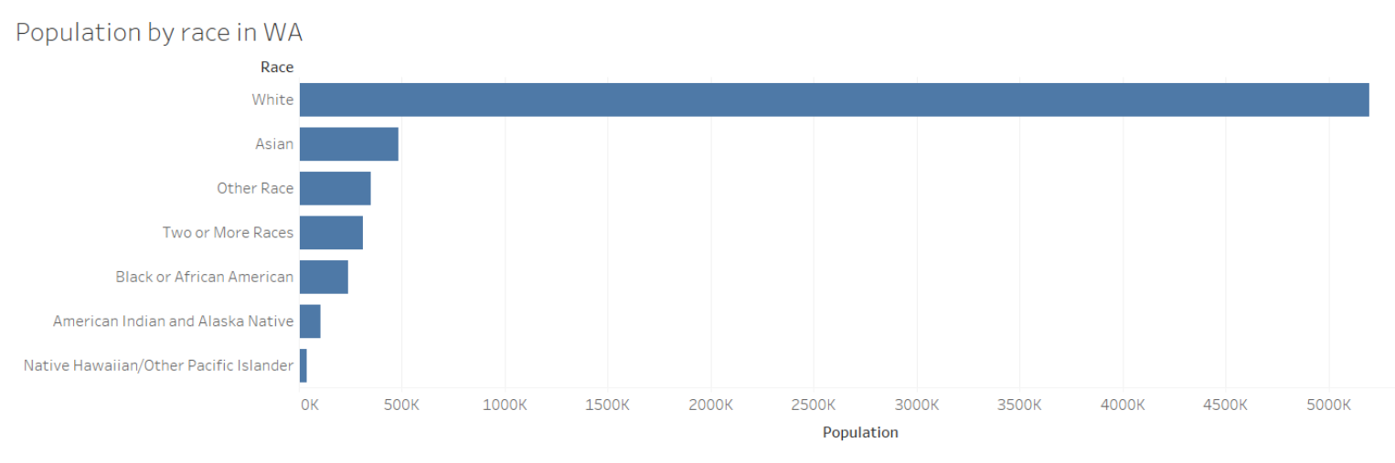
For example, in this chart showing the population by race in Washington, white shows up first and is significantly bigger than the other categories in terms of population. What this does, then, is make us compare everything that comes after that to the first bar, thereby setting white as the default or the norm.
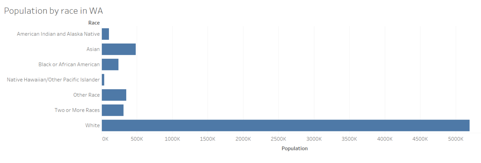
In this next example, the data is sorted alphabetically, which is a different way than size to view the visualization and doesn’t automatically put the largest variable as the default or benchmark.
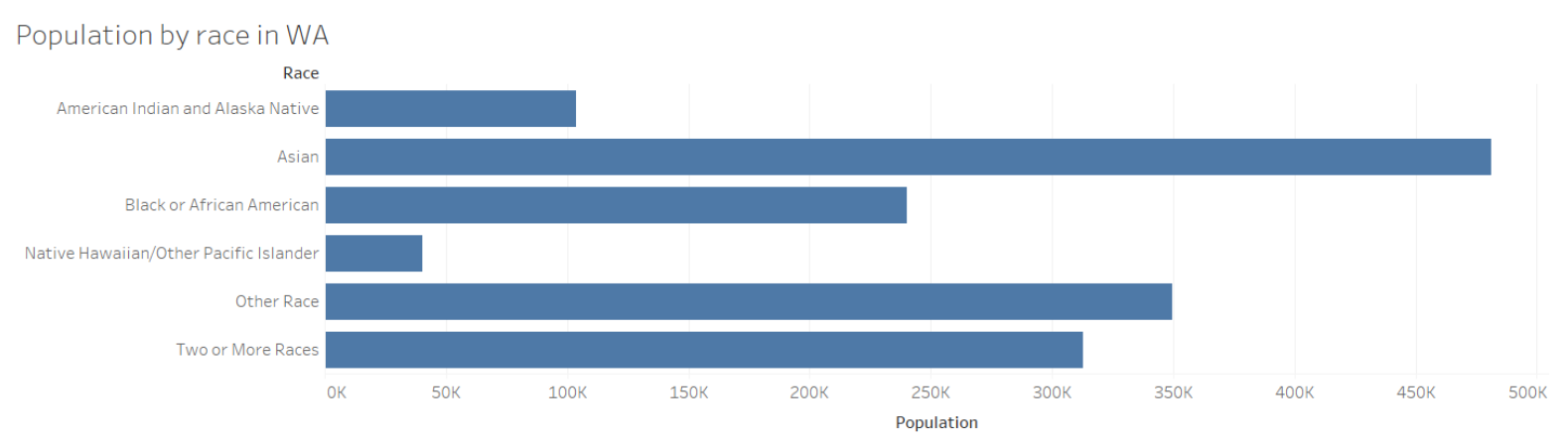
Or, if you’re doing your research or analysis on racial minorities, for example, then it might help to only focus on those groups in your visualization so that they don’t get lost among other data points.
Visual spaces/colors
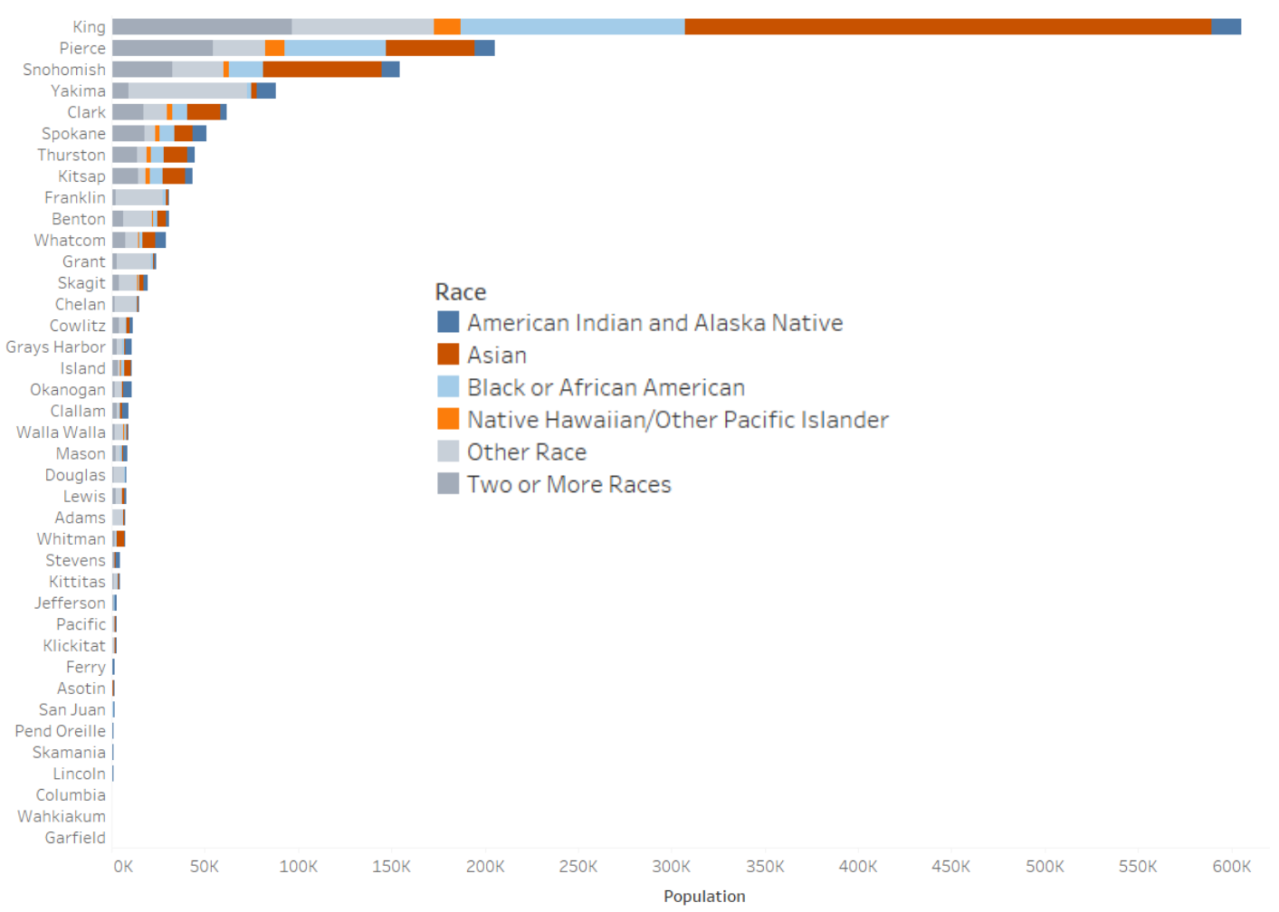
Another strategy to be more inclusive in data visualization is to inspect your visualization for any visual divides you may have created that prioritize one group over another. The amount of square inches on the screen can often correlate to the perceived importance or value of something. An example of how this happens with color is using gray to represent “other” values.
In the chart below, the colors of the “other race” and “two or more races” categories are similar shades of gray. These two categories somewhat blend into the background of the chart and are made almost invisible in some of the bars. That can indicate a perceived lack of value to those who did not identify with any of the other categories.
Mapping
When reading or creating a map, it can help to think about who created the borders of the map – both historically and in whoever created the base layer of the map. Who is missing in the labels, and who is made invisible based on the decisions around borders?
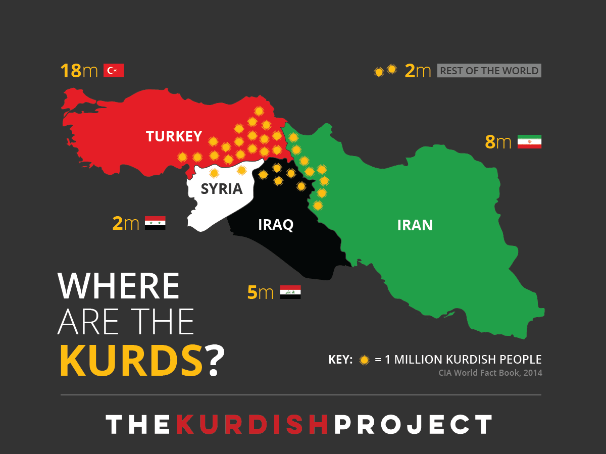
Borders do not always represent people, and a great example of this can be seen in the map below created by The Kurdish Project. It shows how the Kurdish people are distributed across four borders, none of which are a Kurdish state. There is a tension here between where people live, who they are, and how they are or are not represented on certain maps.
Day 3 readings
These are just a few ways to think more critically about data visualization and create more inclusive designs. This is not a comprehensive list! For further conversations about this topic, check out the Day 3 readings:
- Datassist, “How Not to Visualize Like a Racist (Data Viz Designing Across Cultures)”
- Alison Booth, “It’s time for data visualizations to be more inclusive of gender information,” Poynter, March 3, 2021
- Heather Krause, “Is Feminist Data Visualization Actually a Thing? (Yes, and How!),” guest post on Evergreen Data blog
Whenever you are ready, proceed to Day 4, Part 1 or return to the homepage.